Jan 28, 2014
Jan 27, 2014
Commercial for the Brazilian Wine Institute
Escala agency approached Santa Transmedia Productions to create a piece for Ibravin - Brazilian Wine Institute - that would stand out during the commercial breaks.
The result was a graphical extravaganza that takes advantage of the script's comparative nature to set up a dynamic pace. The spot oscillates between the austere tone of the inventions and the playful color explosions that depict how Brazilian culture has affected each of them.
To achieve the final look and fluidity, we used a mix of techniques that range from 3D solutions to traditional frame-by-frame animation.
Labels:
Reference
Jan 26, 2014
Jan 24, 2014
#11 Lightning - Part 1
For lightning there's just a few simple guidelines to follow, beyond that, it's crazy easy to do.
To design the lightning is simple, a combination of most of these elements are needed. It's a shaky line that goes from thick to thin to thick and thin again. The occasional branching out at the bottom and insert of a hole adds variety to it. Otherwise, it's pretty straight forward. figure out where the source is coming from and approximately where the lightning will fall, this is the same with electrocution and characters or objects getting electrified, accept in those cases it often cycles and loops. It's always quite fast so it's easy to get away with murder, it just has to flash real fast, pop from large to small, adding fingers branching out randomly, various thick and thin parts of the lightning arm coming down.
Here's an example at 2 frames per second:
See how once in a while there's a flash frame of pure white, generally this is only for when the lightning is flashing big, or a character is close to camera while being electrified. Usually not necessary if the FX are far away from camera.
Also, ever 2-4 frames, place a blank frame, it adds that flickering aspect to the lightning. In this case, since it's not meant to be an electricity-based looping effect, just a singular lightning strike, there's is a few frames of dissipation on a couple of the actions to make the lightning break apart.
The timeline looks like this:
The lightning is never on screen for longer than 3 frames at a time, with the exception of a full screen white out frame inserted in.
It's a lot of straight-ahead style animation, where you put your Onion Skin on, only see the previous frame you drew, and keep forging ahead, only knowing the size, length, position and timing of you lightning as you go in frame-by-frame and have fun with it.
I'll explore various styles in design and behavior of lightning and electricity in another post soon.
Jan 23, 2014
Jan 22, 2014
New Links
Oil Paintings Handmade Oil Painting Reproductions - sponsor of Wikigallery.org
2D FX Designs from Pintrest.
Concept FX designs and artwork from Pintrest.
2D FX Designs from Pintrest.
Concept FX designs and artwork from Pintrest.
Jan 18, 2014
Jan 16, 2014
#10 Energy Strikes
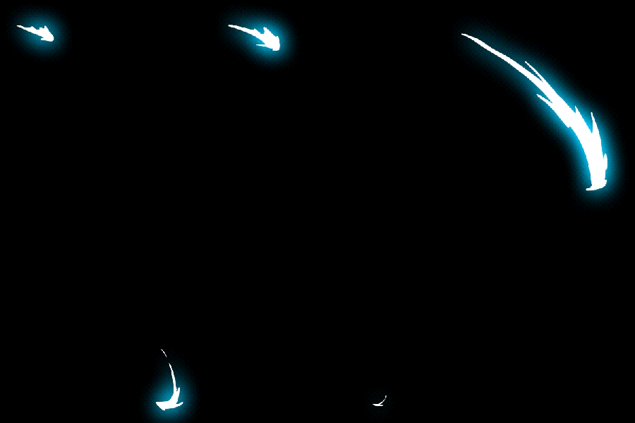
Streaks, Impacts, Energy Hits, Magic Burst, whatever you want to call it, there are plenty of them in all types of animated series, games and films. These were made with Flash CS3In reference to the works of Alex Redfish.
Then I fill it in, any color (I'll change all the colors later), I usually draw in bright red or blue.
Then just straight-ahead animate with the onion skin on, only seeing your previous frame, it's so easy, it hurts.
Then make the top layer invisible, and convert the art on each individual frame to a Movie Clip Symbol, simply click on the first key, hit F8, change the Symbol type to Movie clip, and repeat the process for each frame. Now with Edit Multiple Frames, select all these keys, hit Ctrl+A to grab all the symbols at once.
When they are quick and snappy like this you can get away with a lot you just focus your time on the setup, the impact (or blast out) is instant, then you just inbetween dissipation a lot with the onion skin just revealing your previous frame, and you just animate straight ahead, it's so simply, it's scary!
Here's another energy bolt streaking through.
PLus a couple more drawings to dissipate the line as it trails off.
All the roughs put together looks like this (shot on 1s):
So here's some samples and guidelines for this sort of effect.
First off I'll start off with a common streak of energy.
You'd see this sort of thing on Samurai Jack a lot, he would swipe his sword towards camera, the screen goes black and you see a quick 3 frame slash FX. To do this sort of thing I'll make the animation longer, that way this effect has a broader purpose, it could be used for Starfire's energized fist swinging for a punch, amongst other magic/energy streaking things.
To begin with, I draw the biggest portion of the FX. In this case the big arc that will sweep through about halfway into the whole animation.
Then I fill it in, any color (I'll change all the colors later), I usually draw in bright red or blue.
Then just straight-ahead animate with the onion skin on, only seeing your previous frame, it's so easy, it hurts.
Now for the fun part -- color and special effects.
First, I changed the BG to a dark color just so we can see it better.
Then with the Edit Multiple Frames button activated, I re-colored it all white.
Remember, what gives these energy bolts their color is their glows, the core base is usually white, just think about what gives lightsabers their color, it's not the 'blade' itself but the glow around it.
Now select all those layers and drag them over to a new layer underneath (hold ALT while dragging select frames to instantly duplicate those keys).
Then find the Filters tab, usually next to the Properties window,
if not, go to the Window menu at the top and click on Properties > Filters.
Pick the Glow filter.
Pick your color and jack up the numbers and change the quality to High.
Here's another energy bolt streaking through.
PLus a couple more drawings to dissipate the line as it trails off.
All the roughs put together looks like this (shot on 1s):
Add them glows the same way.
Slo-mo without glows:
Once in a while I look at old Sci-fi Anime and I'm reminded of the fact that the individual frames don't need to make sense, as long as it looks good when playing in real-time. Looking through Japanese animation frame by frame makes you scratch your head wondering why these drawings make absolutely no sense, but once the animation plays out - the visual chaos works out fine.
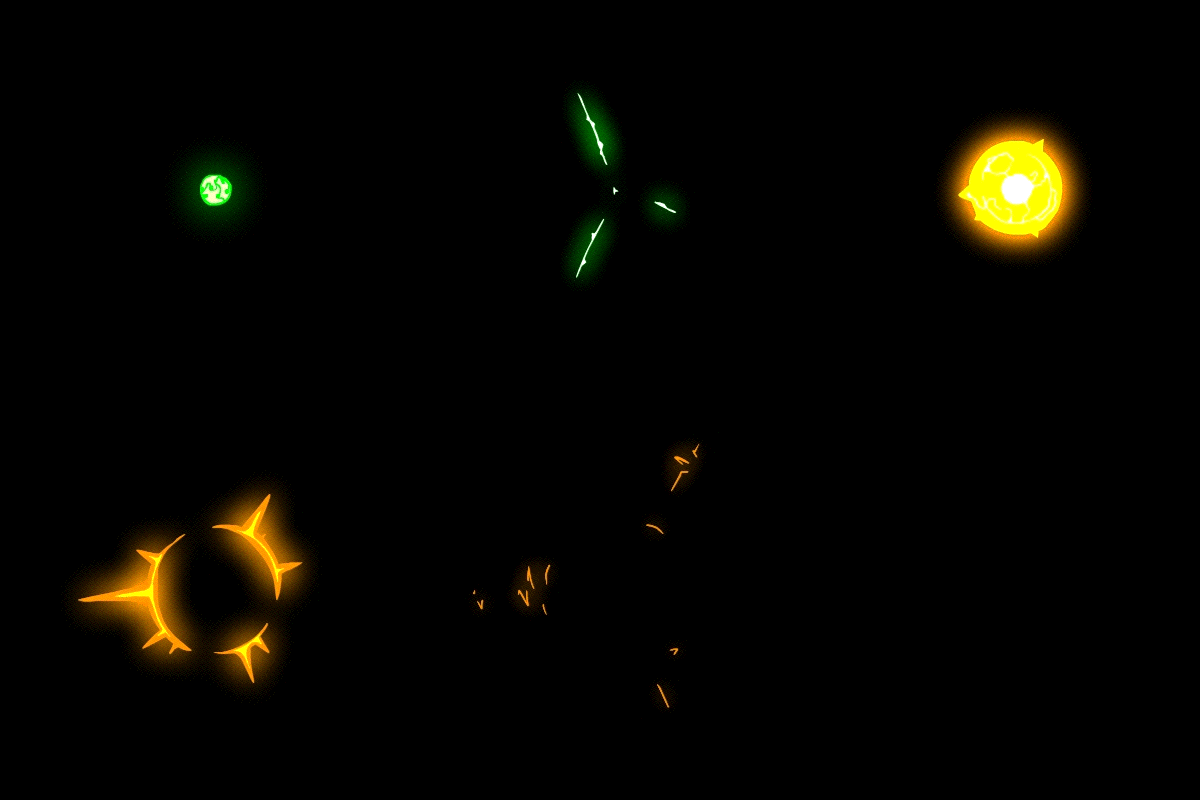
Here's a couple more similar energy impacts and minor blasts, sort of POV style.
The trick to lots of these is to do a build up and a big pop out then dissipate, similar formula to puffs of smoke.
Rough it out first - Implode a circular shape with diagonal-radial line work going inwards.
Blank screen, then a flash of color ( a simple radial gradient).
Then a burst outwards (reversing the implosion with a very simple explosion).
First frame being a ball of energy, the following frames it blasts outwards and quickly dissipated, the inner circular shape shoots outwards (expanding) and random uneven line work scatters outwards and breaks up as it thins out and shoots out like a water ripple.
In this case I doubled up the Glow layer to increase the intensity of the glows since I found they weren't big enough. The glows were set to 20 and the strength to 300, I started off with orange colors then blue after the flash frame.
Slo-Mo:
In this case I doubled up the Glow layer to increase the intensity of the glows since I found they weren't big enough. The glows were set to 20 and the strength to 300, I started off with orange colors then blue after the flash frame.
Slo-Mo:
If there's lots of tiny bits on screen the glows may not register to them, the trick is to lower the 'blur' number son the settings and rising the 'strength' number up high, so the glow stays visible.
For this one, I just made a little spark then the usual flash of light (radial gradient), then a ball of light and blast outwards, the line streaking out I put zig-zags through them to mix things up, then the usual dissipating as I just animated straight-ahead and showed the lines breaking up and shrinking and popping away.
In this case, starting off with yellow-green, then going with a white core with a yellow base color and an orange back-lit glow, then to a regular yellow and orange color scheme for the last few dissipation frames.
It's very easy to get lost in the picky details of these things, please don't, keep it simple, cheat it! Pop to a new position then it's easy to make it dissipate to death. Most bursts, explosions, dust impacts, smacking, striking, blasting, popping FX are fast with a slow settle/dissipation.
One last issue regarding glows and blurs in Flash, sometimes they glitch...badly. Usually when you have an FX animation tweening (while having glows on Movie clip symbols within the main Graphic symbol). If you have a camera move on the whole scene, then it's a guarantee it will glitch at some point, usually the glitches are just the glowing elements getting offset in position and in most cases they just disappear.
To fix this you have to keyframe the area on the main timeline that the glows are happening in, and sometimes if your FX are buried 3 or 4 symbols deep into the timeline, even have keyframes within the camera move. Make sure to save before attempting any 'main-timeline-keyframing' cause it can easily crash Flash.
The smarter alternative would be to render eyers seperately and importing them into After Effects and do your glows and blurs in there, but if you don't have AE, then Flash can do these glows and blurs as well.
FX designs and references from Alex Redfish.
FX designs and references from Alex Redfish.
Subscribe to:
Comments (Atom)


.jpg)


